


A · Edge-to-edge stack
RecommendedKeep today’s vertical flow, but turn every card into an edge-to-edge section with compact headers and separators.
The rendered inventory for BlockPager’s tokens, shadcn primitives, and recurring product patterns. Make a change once, then inspect it here at every supported width.
The shared visual language behind every component. Color samples use semantic tokens rather than fixed values.
Meet the people nearby.
Your block, connected.
Block Conversations
Neighbors on this block
123 Example Street
Reach the people close enough to help.
Updated a few moments ago
Directory
Product UI uses regular, medium, semibold, and bold weights only. Supporting text is never smaller than 11px; compact map attribution is the sole exception.
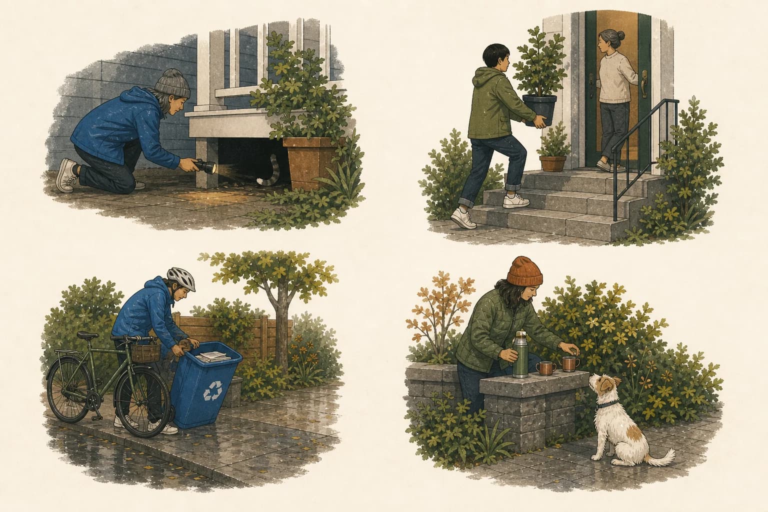
Civic quiet combines textbook clarity, reusable geometric shapes, and editorial observation without turning neighbors into mascots.
Use the optimism of a civic textbook, the system strengths of Corporate Memphis, and the wit and specificity of a metropolitan magazine illustration. Keep natural proportions, ordinary work, and the texture of a real block.
A rain shell, bicycle, planter, thermos, or posture can recur. Names, catchphrases, canonical homes, and implied account identities cannot. Each spot earns its place by showing one modest action.
Button variants, sizes, grouped actions, tabs, and icon affordances—including disabled and selected states.
Field composition, input states, text areas, search affordances, and the Base UI combobox used by shadcn.
Inline status communicates with semantic color, clear labels, and text—not color alone.
Surface and card primitives establish hierarchy without introducing unnecessary shadow or nested chrome.
A reusable eyebrow, title, description, and icon hierarchy.
The 14px presentation radius is reserved for large sheets and modal-like surfaces.
Representative directory data exercises table headers, rows, horizontal containment, status, and row actions.
Three ways the logged-in app could shed desktop card chrome below the mobile breakpoint. Resize the lab or use the interactive tabs to compare density and navigation tradeoffs.
Keep today’s vertical flow, but turn every card into an edge-to-edge section with compact headers and separators.
Let Map, Directory, and Messages become top-level tasks. Each view gets the full screen instead of sharing it.
Keep the map persistent and attach an expandable directory sheet directly to its lower edge.
Messages holds every group a person belongs to. Explore surfaces curated incidents and events, while Profile stays focused on identity, residence, and preferences.
A small set of real compositions catches regressions that isolated primitives cannot: density, hierarchy, icon alignment, and responsive wrapping.
One, two, or three cards remain visible as the viewport grows, with keyboard and button navigation from the shared shadcn carousel primitive.